Make work legible.
Group related actions. Name the state. Help the operator find the next thing that matters.
SULIN / PRODUCT · STOREFRONT · OPERATIONS HUB
The honey needed a stronger identity. The brand needed a place to sell. The website needed a simpler way to manage what happened behind it.
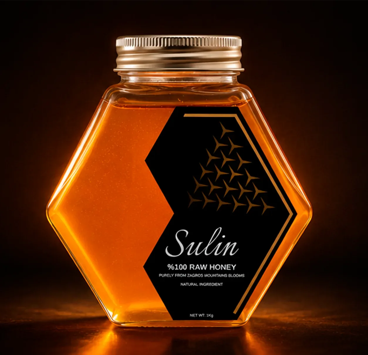
Jar, identity and gift packaging give the honey a coherent premium presentation.
Explore the product ↓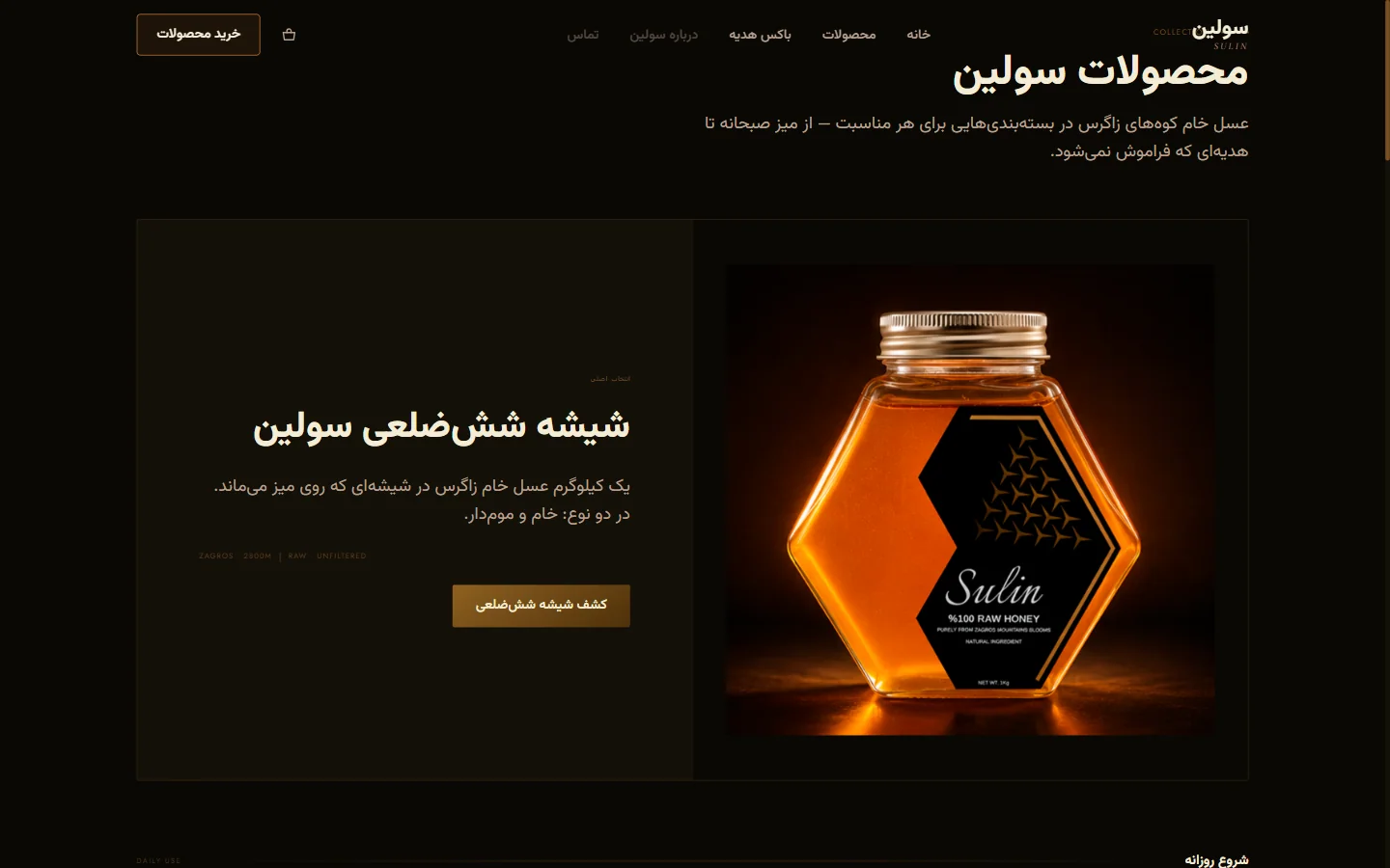
A website connects the brand story to product choices and a purchase journey.
Explore the website ↓An interface for the work behind the storefront: orders, conversations and customer journeys.
Explore Sulin Hub ↓Amirhossein (Aduran) Bahrami
Sulin · Independent commercial brand project
Product & packaging design, brand identity, website design & build, and hub workflow design.
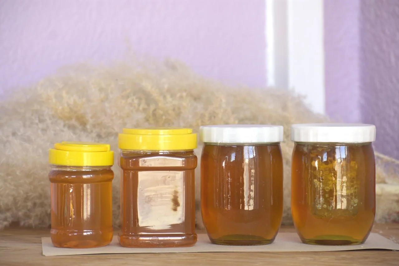
THE BEGINNING
Different jars and lids made the product feel disconnected. I started with a clear design problem: give the honey a recognisable, premium presentation through its form, label and packaging.
First, the shape had to speak.
01 / THE VESSEL
The hexagonal jar gave Sulin a recognisable outline. Clear glass kept the honey in view; the facets gave light something to play with.
The geometry echoes honeycomb without a literal bee illustration. It also gives the label a defined front face. The trade-off: the gift pack must accommodate the footprint and protect the corners.
Then the silhouette needed a voice.
02 / THE IDENTITY
A fluid wordmark balances the angular jar. Black frames the gold details. The label leaves room for the most important colour: the honey itself.
The silhouette attracts attention; the wordmark identifies; the descriptor explains. The asymmetric label keeps these roles separate while leaving the contents visible. Print legibility and label fit still need production checks.
03 / THE RITUAL
Pick up. Turn. Pour. The wooden dipper extends the design into a small daily ritual—a warm, tactile counterpoint to glass.
The handle, grooved head and place in the box should work as one sequence. Grip, jar clearance, cleaning and food-contact finish require physical testing.
And what if that ritual was a gift?
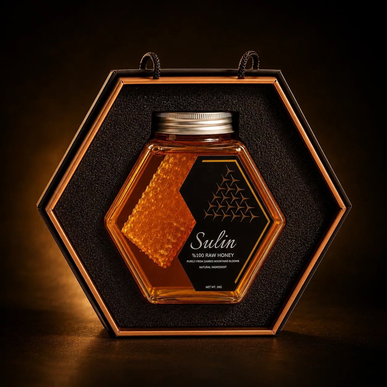
04 / THE GIFT
The hexagon grows from jar to box. A dark insert frames the amber centrepiece. The object is no longer simply packed—it is presented.
The visual direction moves through anticipation, reveal and removal. The jar must be easy to lift, not just beautiful in place. Insert tolerances and shipping protection need separate physical validation.
05 / THE WEBSITE
The next problem was access: a product identity alone does not create a buying journey. I designed and built a storefront to bring product presentation, variants, prices and the next action into one experience.
A hero needs a stable first frame. A cart must remember a choice. A price must mean the same thing everywhere. Those small points of friction shaped the interface as much as its visual direction.
But the experience doesn’t end at “buy”.
06 / SULIN HUB — OPERATIONS DESIGN
Building the website revealed a second user: the person operating it. Orders, messages and customer activity create separate tasks. I approached the hub as a product problem of its own: make those tasks understandable and easier to manage from one place.
PROBLEM: scattered operational tasks.
SOLUTION: one interface organised around the next action.
ORDER WORKFLOW
An order becomes a sequence of responsibilities. The interface should make the current state and next action clear.
Organise around tasks and states, not a wall of numbers. An operator needs to know what to do—not just how much happened.
Illustrative English workflow model, not a live hub capture. Explore each view to see its design logic.
ONE EXPERIENCE. BOTH SIDES.
A message on the site belongs in a conversation. A product change must agree with the storefront. A journey event needs context. The hard part is keeping those handoffs coherent.
Group related actions. Name the state. Help the operator find the next thing that matters.
Keep a conversation attached to its session and a customer action attached to its journey.
A click is not the outcome. Check that a message arrives and a change reaches the customer-facing experience.
The storefront source includes a hub connection for chat sending and message retrieval, session continuity, and events for page views, product views, add-to-cart and checkout entry. Orders and product management are part of the documented hub workflow. The interactive study above presents that workflow logic without exposing customer data. Campaign and sales results are not part of this case study.
The jar made Sulin recognisable.
The hub brings the business into the design.
ONE THREAD THROUGH IT ALL
Each step answered a problem the previous step revealed.
Product, storefront and operations — designed as one connected experience.
For product, brand and digital design conversations, get in touch.