ELARA
A mark with a world
A fashion identity developed from one letter into a visual system, then tested across concept applications for a store that never opened.
The problem
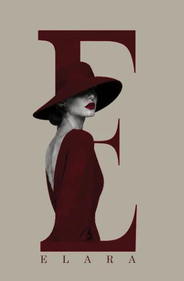
The initial preference was a wordmark. I explored whether the letter E could carry the brand's elegance and remain recognizable across different scales and touchpoints.
My role
I created the full original ELARA design: mark, visual identity and the presented applications.
The output
A consistent monogram, editorial visual direction and six supplied concept applications. Manufacturing, storefront opening and physical retail execution are not claimed.
One gesture.
Several surfaces.
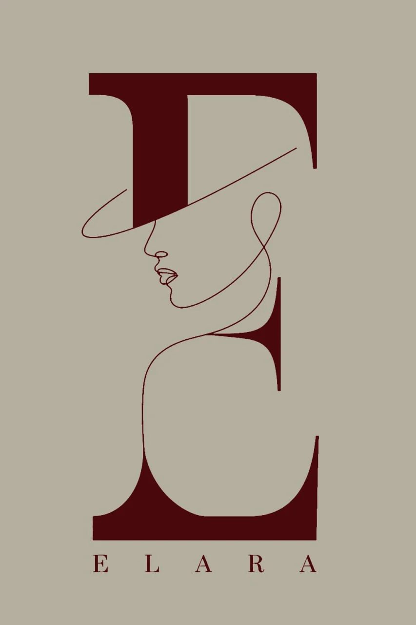
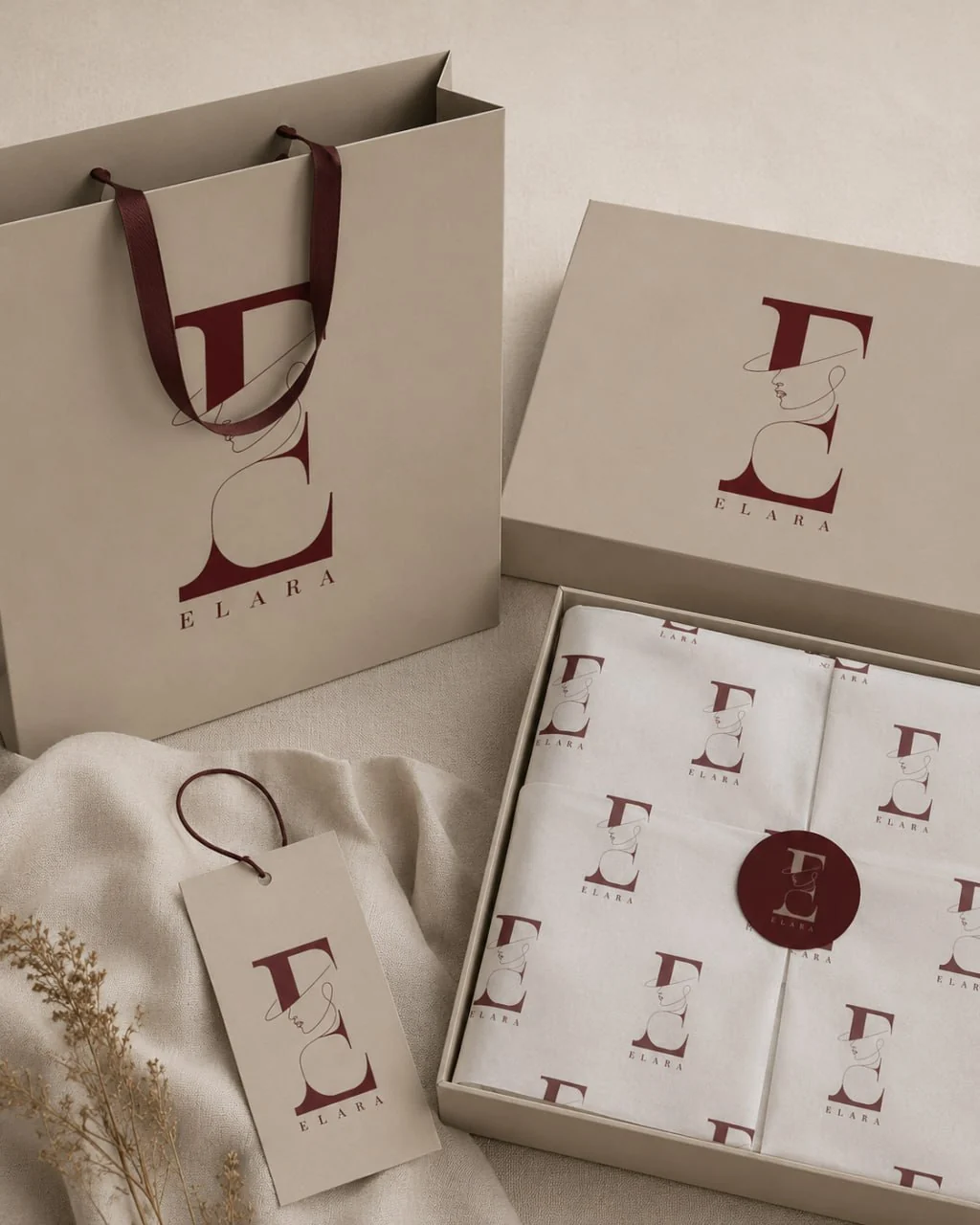
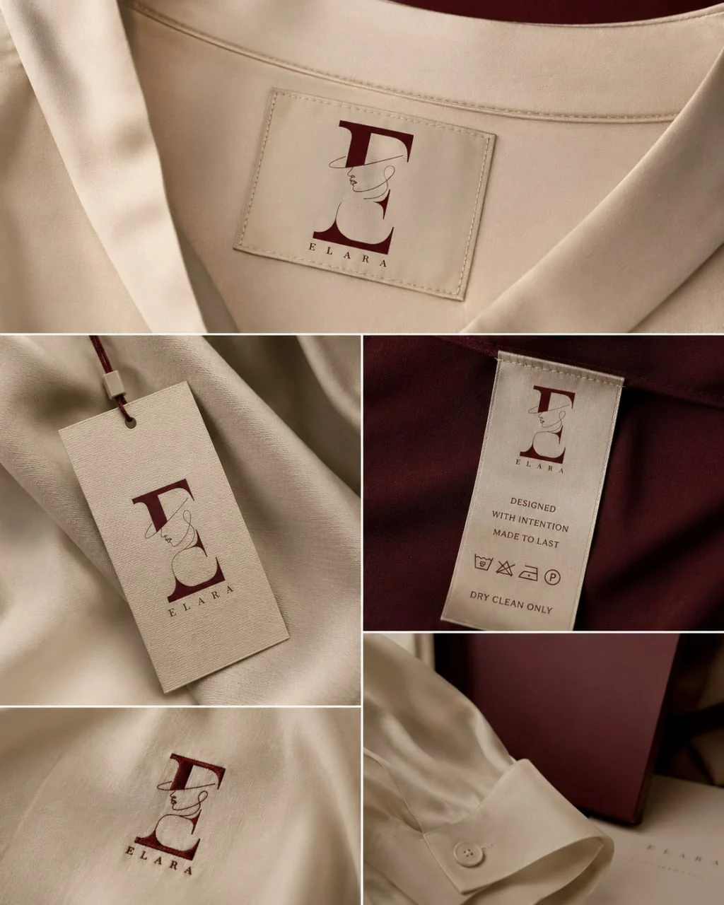
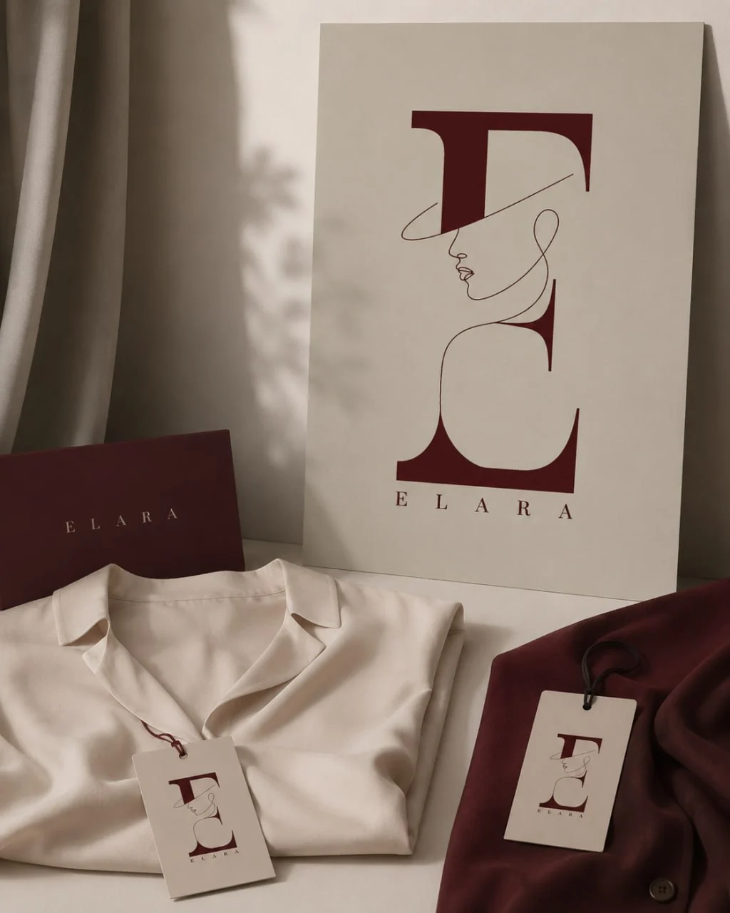
I tested letterforms and compositions, then reduced a portrait idea to a line illustration integrated into the E. The restrained burgundy mark, warm neutral field and silhouette carry through the concept applications below.
Proof and status.
- Authorship of the complete original ELARA design is confirmed by the owner.
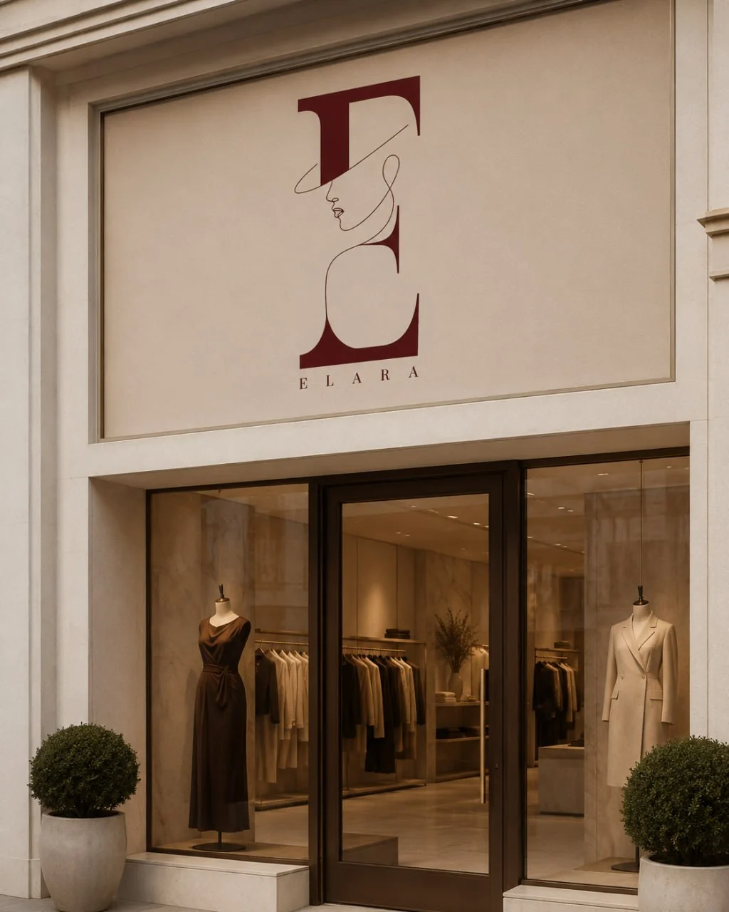
- Six original supplied images show how the visual language extends across media.
- Storefront, garment and package scenes are labeled concepts; they do not establish manufacture, opening or distribution.